Uncovering the brand’s purpose
Be More Fox wanted us to focus on the word 'Fox' in the logo device and their mission statement set the tone for the design process: "For those who give a damn about the world, we’re your partners in crime. From fighting for sustainability to breathing life into regeneration, we’re here to kickstart a movement towards a cleaner, greener future – one badass strategy at a time.” This powerful declaration of purpose immediately informed our approach. We knew the logo needed to embody the brand’s commitment to environmental care, social impact, and quality. It had to be a cohesive visual representation of their dedication to empowering eco-conscious and community-driven businesses.
Embracing an organic aesthetic
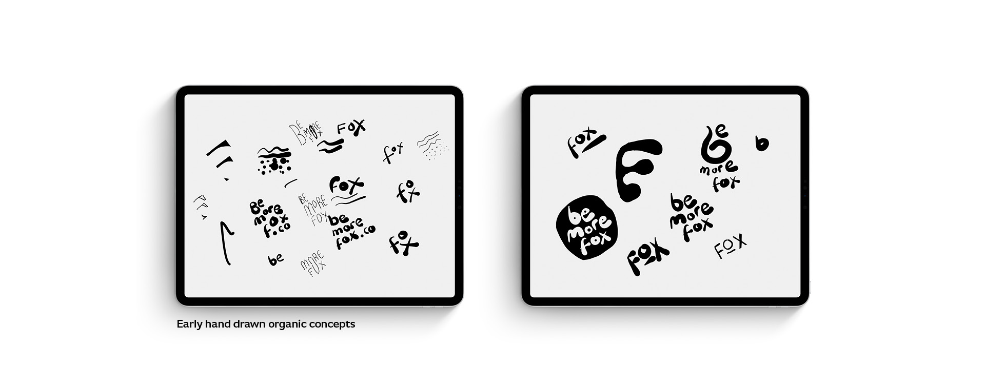
To capture the essence of the brand, we chose an organic and hand-drawn style for the logo device. The initial exploration involved experimental scribbles and sketches, allowing us to discover the natural flow and energy that would define the final design. As we refined the concept, the individual letters of the "fox” wordmark emerged, each one imbued with a sense of movement and authenticity. The letterforms created a subtle directional element, suggesting the brand’s forward-thinking approach and its ability to guide clients towards their goals.

The significance of the full stop
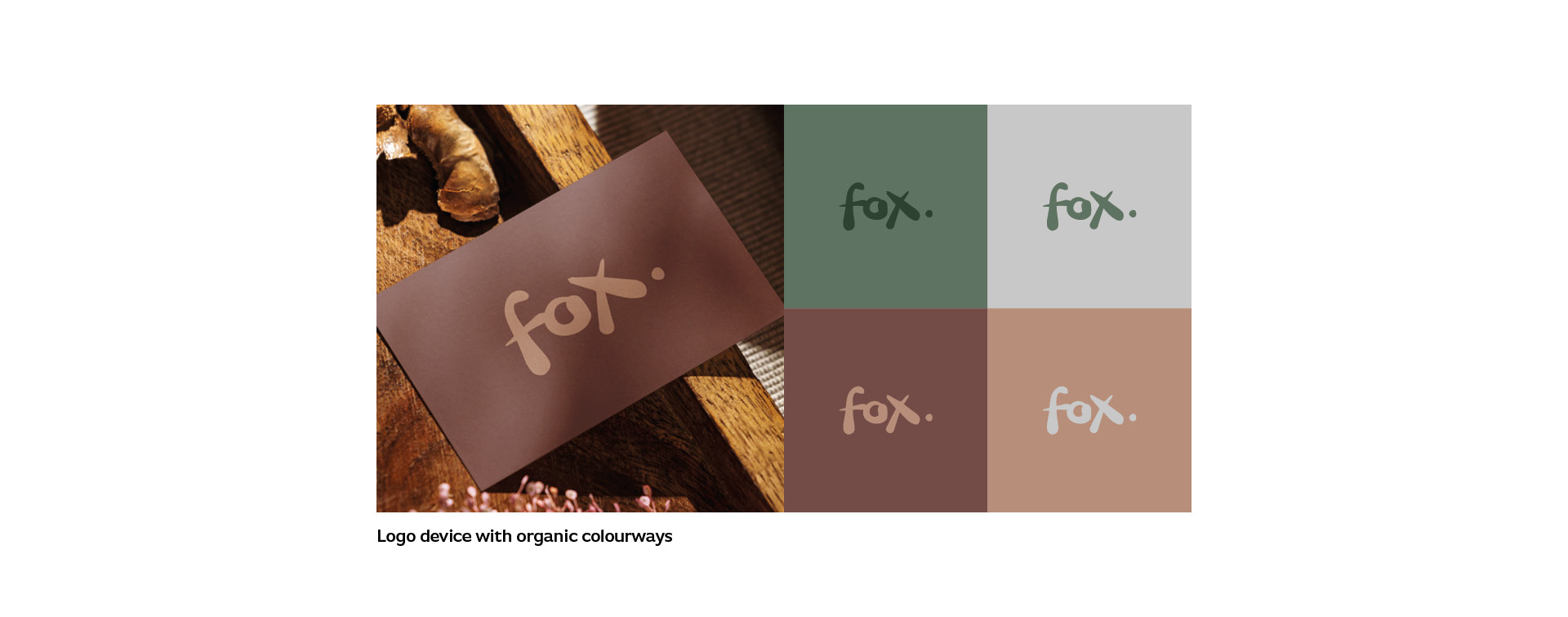
The addition of the full stop at the end of the "fox” wordmark was a later decision that elevated the design. Beyond its practical function of punctuating the logo, the period served to emphasise the brand’s commitment to quality and precision. As the mission statement highlighted, the brand consultancy’s focus is on "quality over quantity, always.” The inclusion of the full stop aligned with Be More Fox's positioning. The full stop also contributed as a useful aesthetic to the wordmark by highlighting the 'flow' of the hand drawn letters.

Bringing the brand to life
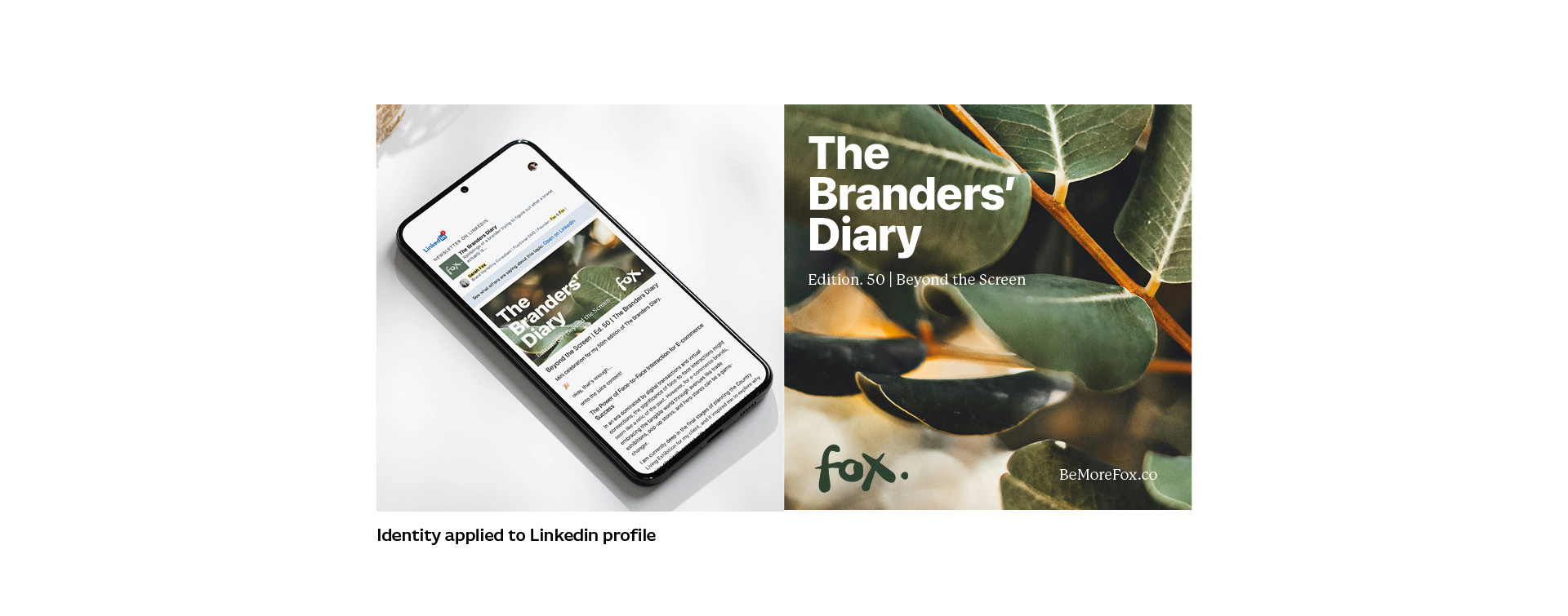
To further amplify the brand’s identity, we developed a complementary color palette that reflects the natural world. Earthy tones of green, brown, and grey create a visually striking and cohesive brand aesthetic that resonates with the target audience.When applied to the client’s LinkedIn profile and the cover of their "The Branders’ Diary” publication, the logo device and color scheme come together seamlessly. The visual identity and associated imagery speaks to the brand’s purpose, instilling confidence in the businesses they serve and positioning them as trusted partners in the pursuit of a more sustainable and equitable future.
