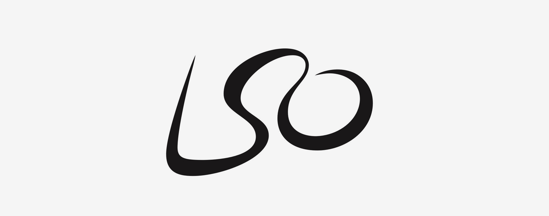
London Symphony Orchestra
At first glance, the LSO logo looks like a simple scripted letters ‘LSO’. But look closer, is that an abstract illustration of an orchestra conductor we can see?
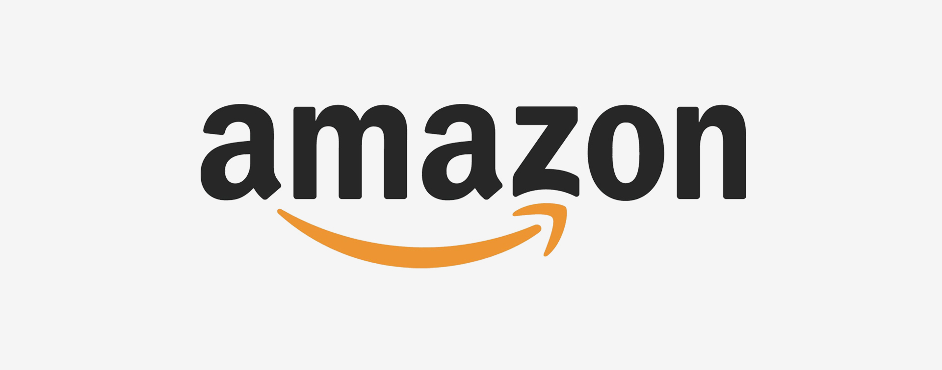
Amazon
Yes, it’s a stylised smile, but look carefully at the letters its pointing to. Is it a coincidence that they are both A and Z? It sums up perfectly that you can buy everything from A to Z at Amazon.
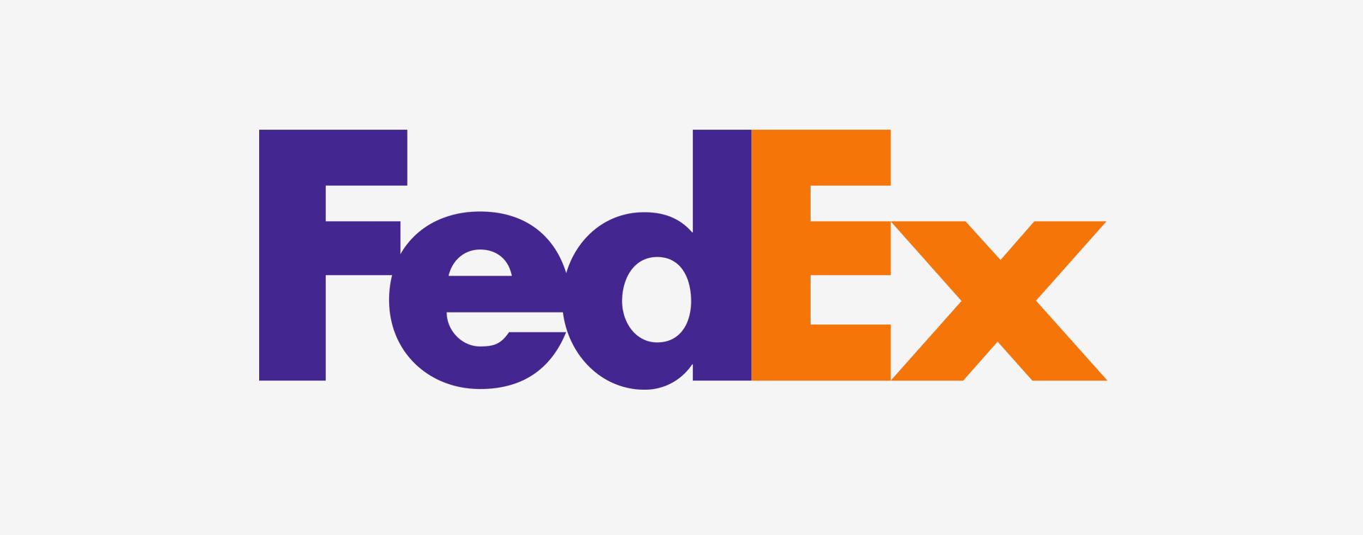
FedEx
The famous logo makes clever use of negative space. Look carefully and you can make out the arrow...delivering from point A to point B. Classic and still one of our favourites.
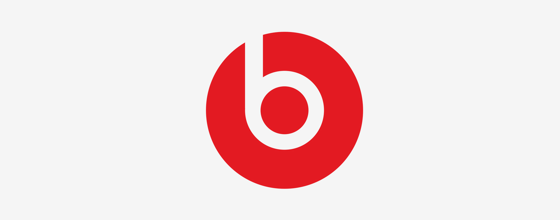
Beats
As well as obviously being a stylised letter ‘B’, the Beats logo also represents a person wearing headphones, which kind of ‘does what it says on the tin’ as an advertising copywriter once said.
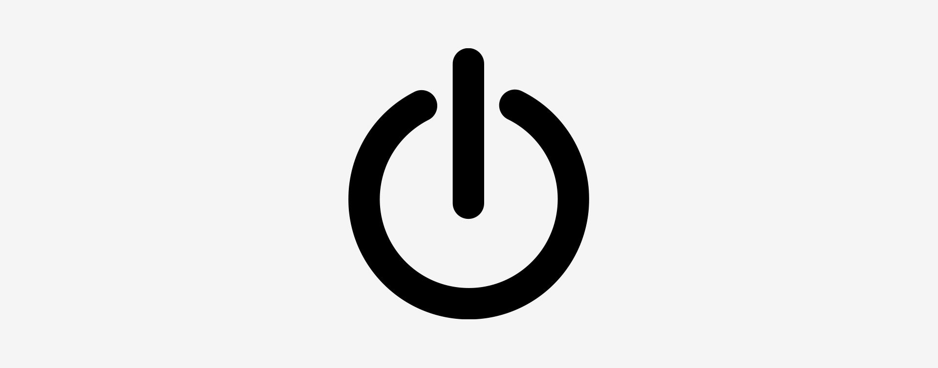
Power Symbol
Whilst not a logo as such, the universal symbol for power on/off was designed to bypass language barriers. Many speculate that the design is based on binary. The number ‘1’ (on) and ‘0’ (off)
and finally....
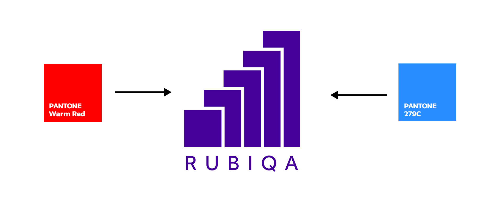
Our own logo was developed to represent our company ethos of "design for results", represented by the growing bars on a bar chart to show progress and growth.
But why is the colour purple used?
Well, Rubiqa was borne out of two separate companies and one had a red logo and the other, you’ve guessed it, had a blue logo. So merging the companies (and brand colours) meant the new brand colour naturally became purple.
This demonstrates our approach to branding projects: when we design a brand logo for a business, large or small, we listen and understand, knowing that our finished design will represent the core of a brand and, for the client, provide a long term return on investment.