An iPhone app has a natural feel to it. Apps have a familiar look and feel and a user’s experience of using one app often gives them sufficient intuition to use another.
And the same’s true for people who use Android phones. But when you compare your app running on an iPhone with your app running on an Android device, they shouldn’t look identical.
Let’s look at this demo app and see some examples of where this applies.
Tabs
Straight away, you’ll notice on the Android device that the tabs for each section run across the top of the screen. And the currently-active tab has a line underneath it.
On the iPhone version of my app, the same tabs run across the bottom of the screen, just where an iPhone user is accustomed to seeing them. And the non-active tabs are greyed-out.
Accept these differences! Don’t be tempted to move the tabs to the top of the screen for both devices because that won’t feel right for an iPhone user!
If you’re involved in an app development project, the golden rule is to allow each version of your app to be what it wants to be.
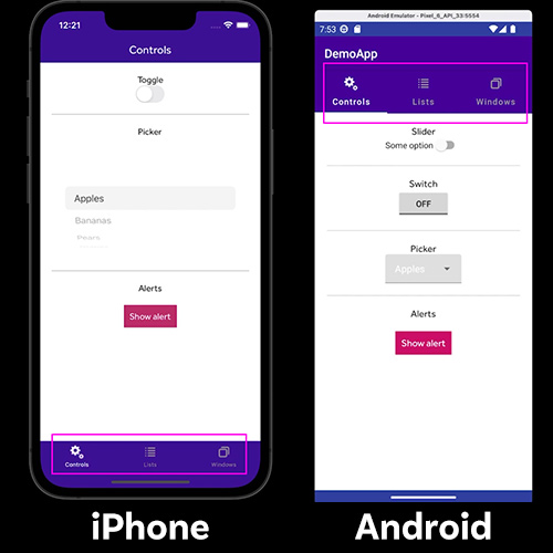
Controls
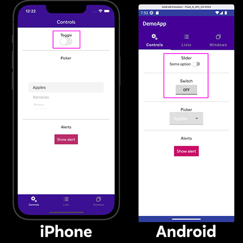
Similarly, the same controls on your two apps will look different. Android users will be familiar with the switch and on/off buttons shown in the screenshot. For iPhone users, the toggle switch serves the same purpose but looks different.
Dropdown lists on Android and iPhone devices work in pretty much the same way but they do render differently.
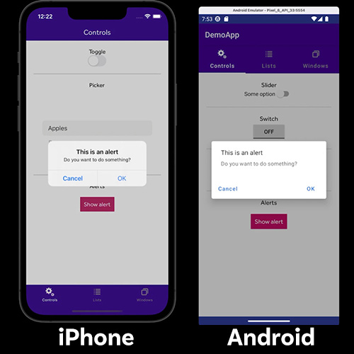
And if you need to show an alert message, an iPhone renders the popup with familiar Apple styling whereas on an Android device, the same alert gets displayed differently.
Resist the temptation to make the two apps look the same! It might feel like the right thing to do because common sense tells you that you want consistency and brand uniformity – but your users will not appreciate it!
Lists
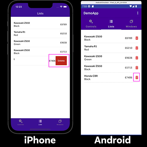
When your app shows data in a list, your iPhone user will know instinctively that to remove an item from the list, they should swipe left and look for an "edit action”, which in this case a delete button.
For Android users, this is a much less familiar gesture and you would typically provide a visible delete button in the list when you design your Android app. Android users know to tap on the button to get the item removed.
And when it comes to updating a list, an iPhone user would pull down to refresh, knowing that this causes the app to load any available new data. But this isn’t a typical thing to do on an Android device. Instead, an Android user would look for an option in the menu at the top and use that as a way of updating the list.
Windows
Android and iOS handle new windows quite differently.
iPhone users are used to seeing a back button appear automatically in the top left corner when they open a new Navigation Window. When pressed, the button closes the window and returns you to the previous screen. And this process is often animated, as you can see.
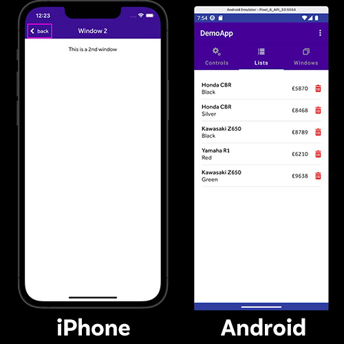
For Android users, the phone’s inbuilt back button – which is usually invisible at the bottom of the screen until you press in that area – serves the same purpose. For an Android user, showing a back button in the top left of the screen would seem weird, even though that’s consistent with how your app displays on an iPhone.
App icons
If you have an iPhone, you’ll know that all app icons are the same size, have rounded corners and the name of the app appears beneath the icon. When you design your app icon, you don’t actually include the rounded corners as that gets done for you by Apple.
On your Android device, the app icons look different. These days, Android lets you use Adaptive Icons, which is an icon that can alter its display depending on the user’s device and settings. But the standard icon for an Android app is circular, like these:
![]()
So if you’re involved in an app development project, the golden rule is to allow each version of your app to be what it wants to be, which is an app with familiar styling, native to that device, so that users instinctively engage with your interface and get the most out of using it. If you encounter someone on your project who proposes that your Android and iOS apps should be styled identically, you now know how to explain to them why they’re wrong!