Recently, I paid a visit to the furniture design capital of the world, Copenhagen. And after a few days of enjoying the sights and developing an even greater obsession with Danish furniture, it was time for me to buy a souvenir of my time in the city.
I’m not really a fridge magnet sort of person, and whilst I would have loved to take home the three metre Rosewood Dining Table I spotted on day one, I’m pretty sure SAS would have considered it to be oversized cabin baggage. So I went for the next best thing, a Minimii 1:16 scale model of Arne Jacobsen’s iconic ‘Egg’ chair, one of a range of different chairs on offer. It was the closest I would get to owning the genuine item and even allowing for my terrible packing skills I was pretty sure it would fit in my suitcase.
Firstly, a bit of background to ‘The Egg’ and it’s designer Arne Jacobsen. Jacobsen was an architect, and designed (amongst many other things) Copenhagen’s Royal SAS Hotel, as well as its furniture. Subsequently, three iconic chair designs; ‘The Egg’, ‘The Swan’ and ‘The Drop’ were unveiled in 1958. Countless reproductions have been produced ever since, as well as miniature scale models ready to tempt unsuspecting design aficionados the world over, all wanting to own a sample of Copenhagen’s design heritage.
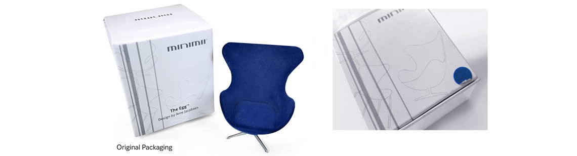
The problem with a box
It has to be said that it wasn’t the packaging that first grabbed my attention to these scale models. Although they looked superb as a collection on display, the packaging did little to inspire my curiosity. Housed in a simple cardboard box that not only looked uninspiring, it also caused problems for the retailer when less than honest customers tried their luck. "We always have to open and check all the boxes” said the cashier when I went to pay for my mini Jacobsen. "Because some people swap the chairs around, so they pay less for a more expensive model. From the outside, we can’t tell the difference”.
To make matters worse, a little fabric swatch stuck on the outside of the box was the only clue as to what colour the chair inside was. And because some of these labels had peeled off, many boxes had been torn open so that customers could see what they were buying. (It did however, give me the insight that the grey chairs weren’t a popular choice.)This led me to think; surely a product as unique as this could be packaged better? I set myself a design brief, to design a new packaging concept for the MiniMii miniature chairs.
A simple solution
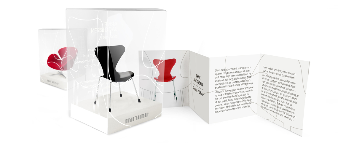
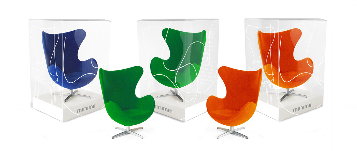
The brief was simple, the box had to be universal to fit each chair design, take minimal shelf space and still have space available for printed information such as copyright, safety notices and a barcode. It would need to be made from a transparent, recyclable acetate. This would mean the product could be seen without opening the boxes, be easily die cut and screen printed as well as being cheap and environmentally friendly to mass produce.
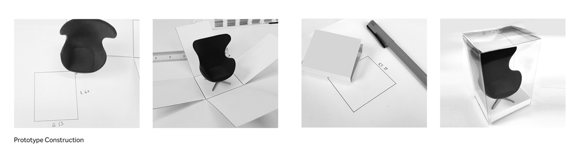
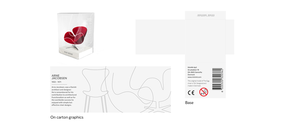
My initial thought was to keep things simple, keeping the plinth white. At first, this seemed a little too obvious. So I investigated whether I could take inspiration from a Danish room and reproduce a wooden floor texture. This looked great and I began trialling ideas using a parquet patterns and simple floorboard concepts. Although things were going well it felt a little off brief. Looking again at the Minimii product range, it was obvious that the original idea of a white plinth with a subtle MiniMii logo would fit better with their overall product range. The shapes of the chairs are iconic, so it would seem a missed opportunity if I didn’t incorporate these shapes into the design somehow. Screen printing the shapes onto the boxes would provide interest, whilst still keeping the product visible. In fact, once applied to the boxes, the outlines almost took the form of Jacobsen’s early concept sketches, which added to the authenticity of the packaging.
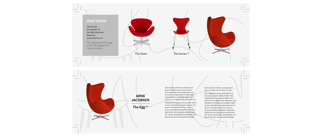
Finally, there was the information booklet to consider. It was important to include information about Jacobsen and each chair design. A simple Z fold leaflet was created that provided a brief history of each chair design as well as serving as a useful cross selling ‘collect them all’ type insert. The same shapes that were screen printed onto the outside of the box were also added as a background image.
Hopefully I’ve demonstrated a relatively simple design solution to a practical packaging problem. I’m convinced the new style box would sell more of these scale models, particularly when combined with a point of sale display unit. I’d definitely like to move the project on when I get more time, perhaps to include concept designs for the POS.
Overall, I’m pretty pleased with the result, and maybe one day my concept will get used. But if not, it’s still been a useful exercise to prove that great products sell themselves, they sometimes just need a little help from creative packaging.