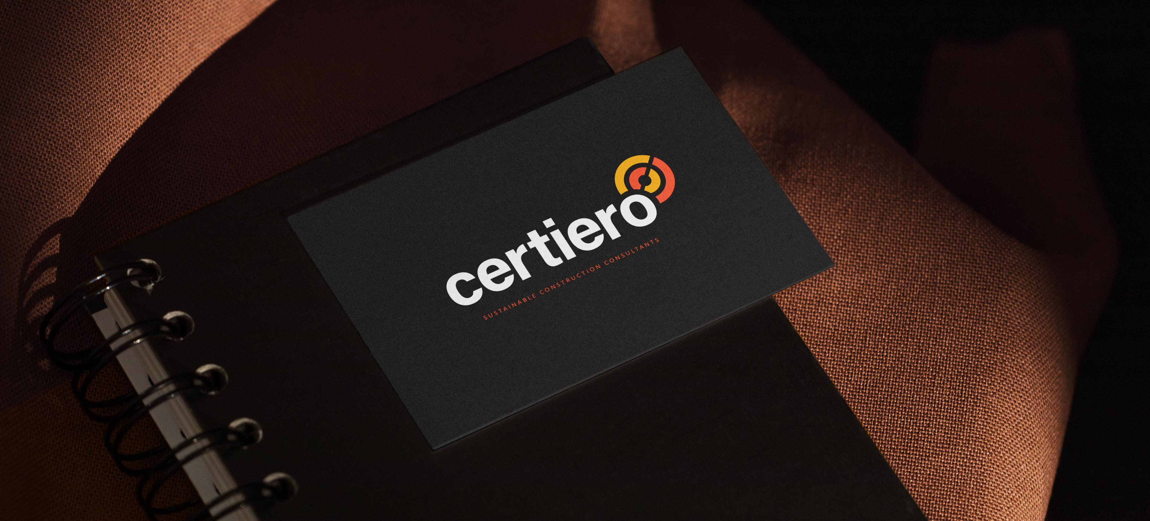

Helping Certiero stand out from the crowd
Certiero approached us after hearing about our success branding other start-up businesses. As an environmental consultancy, they operate in a crowded market competing with rivals who often use a tired, cliched vision.The brief was simple… make Certiero stand out from the crowd and reflect a pleasing alternative to the competition. The name Certiero is comprised of the words "certified” and (carbon) "zero” and so we developed a unique identity based around the figure "zero”. This, together with the vibrant colour palette based on solar energy, formed a strong, positive visual identity which we applied to stationery, presentations and reports.

