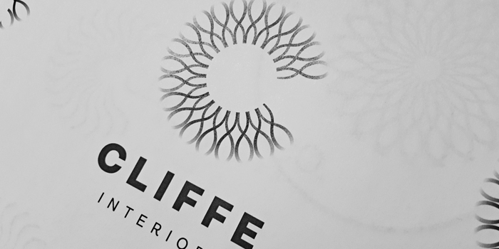
Cliffe Interiors specialise in kitchen makeovers. This newly established, family-owned business asked us to develop a distinctive brand identity and logo device for their new city centre showroom.
As a starting point we considered the role of a kitchen.
Not only is a kitchen an important asset that affects the value of a property, many new build houses combine kitchen and dining areas, turning it into a space for people to eat, socialise and cook. This was the beginning of our creative process. We needed to design a concept that positioned Cliffe Interiors at the heart of modern living, which presented a challenge, how to depict this idea graphically?
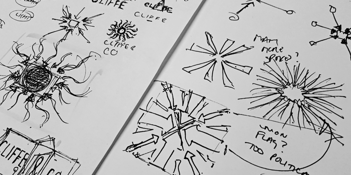
Initially, we sketched a series of arrows pointing inwards. This concept came from the idea that modern families are busy, but always end up drawn back to the heart of the home. The result was too geometric, but we did like the idea of the ‘hub and spoke’ concept and decided to develop the thinking further. It also made sense to reflect the wooden textures of the product,so we curved the lines slightly. Now the design began to look more like a sunburst.
Not bad, but too generic, so, we explored whether the name ‘Cliffe & Co’ could be incorporated into the brand logo device. Although it didn’t work, it did give us the idea of mirroring the sunburst to provide a more interesting shape.
But now the design was too decorative. This would position the business as an interior design showroom not as a kitchen retailer. The starburst made the device look like a mirror or wall clock and we were heading in the wrong direction.
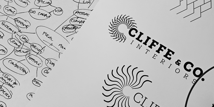
However, by enlarging and reflecting the second sunburst, the design became more relevant, less fussy and took on a more practical quality. This was the starting point for the chosen concept. We reverted to incorporating the name within the logo, this time focusing on the initial only. By removing the centre and the side section of the pattern, the design began to look like a stylised letter ‘C’.
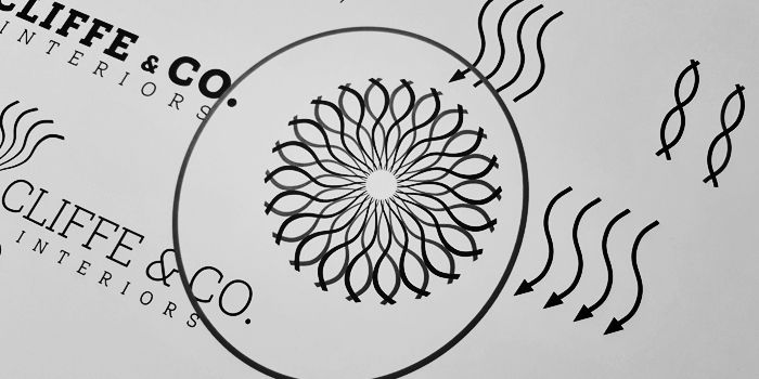
The device was now pretty much complete although we considered developing an alternative version with feathered edges. This design was quite popular, but it was rejected because of practical considerations: for example, how would the logo be die-cut? In this instance we would need two versions of the logo, which would be overly confusing and expensive for the client to implement.
There was still one issue that was still bugging us: the name.
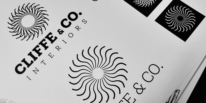
The ‘& Co’ felt too formal for the target audience and sounded more "professional services” rather than a B2C retailer. By shortening the name simply to ‘Cliffe’ the typography became easier on the eye. Losing the ampersand meant we could select a clean San Serif font, (Lota Grotesque, in this case) which also forms part of of the overall brand identity. The increased spacing between the letters improved readability (remember: the showroom is on a busy high street). We also applied the spaced-out lettering idea to the stylesheet for use on showroom and window displays, as well as press advertising and flyer designs.
The client already had a colour palette they liked and felt it complimented their product range. We agreed: the colours were earthy and homely, although we swapped the black for a dark grey. Sometimes, black can be too heavy, particularly on a delicate-looking logo device.
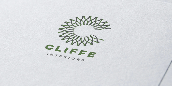
The finished design was one of three concepts we presented and the client selected it immediately.
Designing a brand identity and brand logo device is a labour of love. It’s a complex process, taking into account many important considerations throughout the creative journey. We work with clients who understand that a brand identity is an important business asset. People often choose products based on their perceived value rather than actual value and all of this is down to a brand.
If you don’t see the value in having a well considered brand strategy, brand identity and logo, think about this: how many people see your identity every day without you even knowing about it? What is the risk to your business if it gives out the wrong message? Why should a customer risk buying from you if you don’t take your own business seriously enough to invest in a considered brand identity and brand logo device?
Look at some of the most famous brands in the world, and you’ll realise that the results speak for themselves. They are famous for a reason.