Title case: the professional standard
Title case (Dior, Microsoft) projects authority and tradition. It’s particularly effective for established brands in conservative industries such as finance or law. The balanced capitalisation creates visual hierarchy whilst maintaining readability.
Sentence case: a modern approach
Sentence case (Facebook, Amazon) feels conversational and approachable. It performs exceptionally well in digital environments, integrating seamlessly with social media and mobile interfaces. This format suggests innovation and accessibility.
All caps: a bold statement
All-caps logos (BMW, IBM) command attention and suggest strength. They’re particularly effective for acronyms and when maximum impact is required in constrained spaces.
Aesthetic considerations in practice
As a designer, there are also lots of aesthetic considerations we evaluate. Every brand is different and every name unique and it is here where I focus on which letters appear harmonious when placed together.
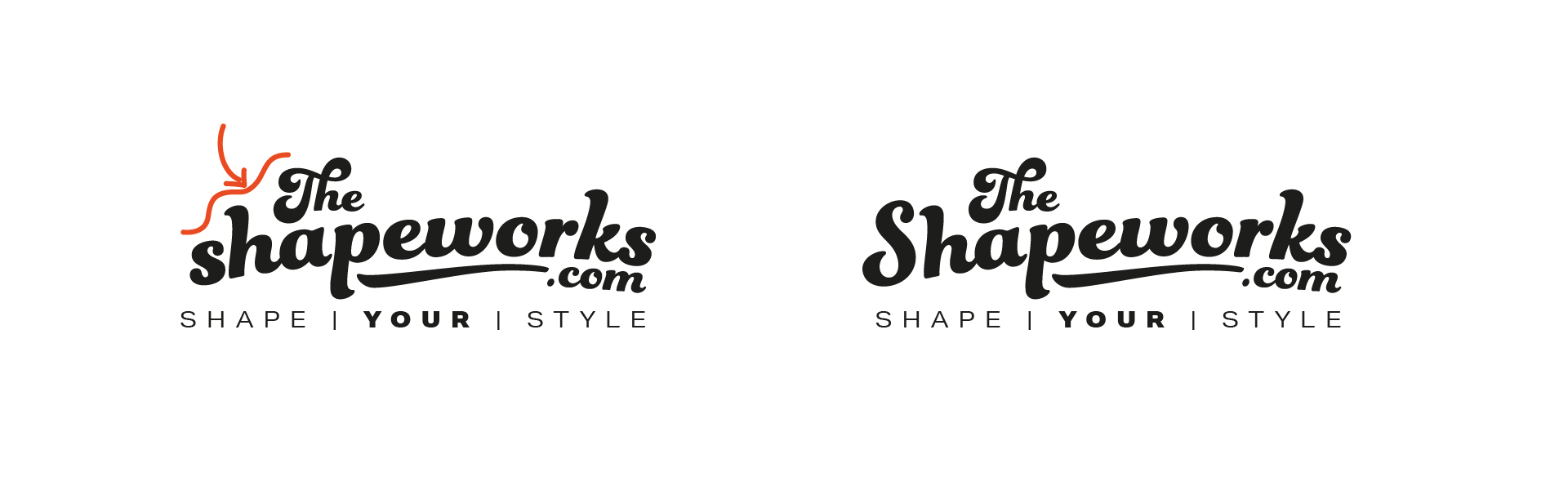
Consider the example below: a brand identity we created for fashion retailer TheShapeworks.com. The script font for this brand makes perfect sense. When using scripts, capital letters become a non-starter. Script fonts (or cursive fonts) make little visual sense as all capitals, since traditionally they are designed to emulate handwritten letters. Comparing the all-lowercase version with the selected title case version, we can see that the wordmark loses its presence. It also creates an awkward stepped configuration that doesn’t complement the word ‘The’ at the beginning.
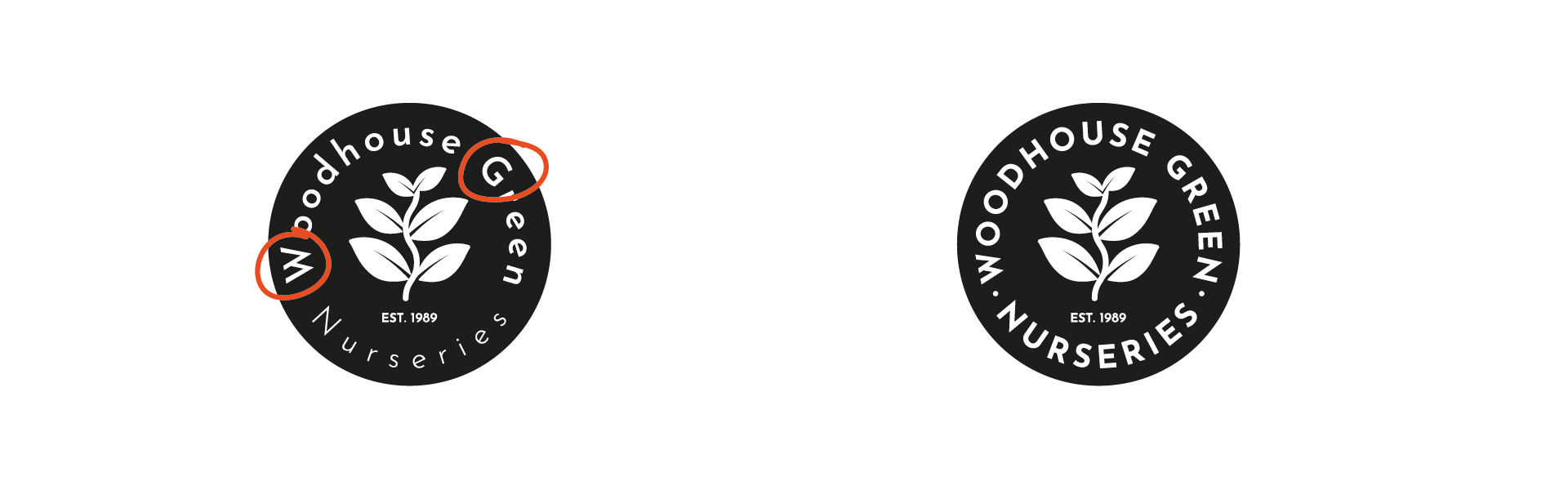
The next example demonstrates a device we created for Woodhouse Green. Capitals work effectively here because the logo employs a badge-style approach. This design type draws its heritage from ancient wax seals and guild badges, closely associated with premium-quality items. Capital letters provide consistency within this style. Without the all-caps treatment, the logo becomes more difficult to read, leaving us with an unbalanced design that places odd emphasis on capital letters over everything else.
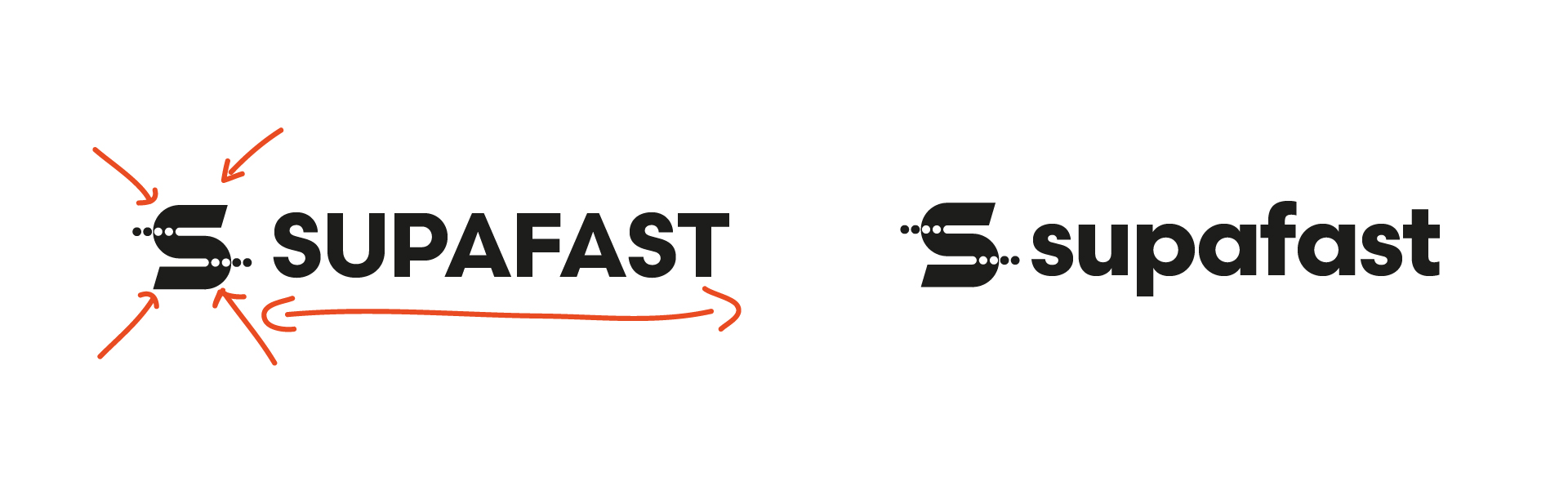
The final example showcases the all-lowercase Supafast brand logo. The typeface lends itself well to lowercase letters in this instance. Although the word includes letters with descenders and ascenders (p, f, and t), collectively they work harmoniously as shapes. Had I opted for uppercase, the logo would not only be ‘shouting’, but the text and symbol would become unbalanced. The text would dominate, rendering the logo device less significant.
Whilst such decisions might appear insignificant, they represent one of many choices a brand identity designer must make when creating distinctive and effective brand identities. Typography becomes part of a brand’s DNA and must be chosen with care.

 Back to all articles