Landing pages have a very different role to the majority of other pages. Consider them to be adverts, designed to take the user to the next stage of the funnel.
Landing page fundamentals
A landing page should be highly visual and able to draw attention and make users curious about the business. It should be optimised for both mobile and desktop devices. Ecommerce websites are accessed much more on mobile devices, so bear in mind the smaller screen, and make sure cookie policy messages don’t cover key information.
Don’t forget the importance of white space - too many colours can confuse users and make it harder for them to take action. Keep the overall design simple with a white or very light coloured background; too much visual clutter will decrease conversions.
Lose any unnecessary buttons that take users off onto a tangent including social media links. Yes, this stuff is important , but its not for the landing page. You want to specify the route the visitor is taking not them.
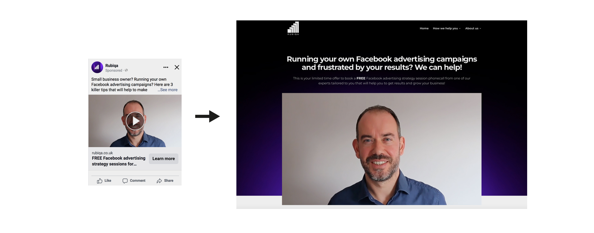
Your branding on your landing page should be 100% consistent with the ad or link that is driving the traffic. It has to be absolutely obvious to visitors that they have reached the correct webpage, and the easiest way to reinforce this is by the use of colour and brand identity.
Lead forms should be short and to the point. You may not need their address at this stage, and titles are largely redundant nowadays. Just grab the visitors' email address or phone number as early as possible. More fields equal more drop off, so prioritise the information you need. Make contact forms appear as high up on the page (above the fold) as possible.
Use Large, Eye-Catching Buttons
Make the desired outcome obvious. For example, a buy it now or get in touch button has to be the most obvious thing on the page. Don’t assume that visitors will automatically know where to click. Use bright colours for website buttons and make sure they are large enough so that visitors can easily spot them from any angle.
![]()
You could try subtle animations like an expanding outline around buttons when users hover over them to make them even more eye-catching, but remember that mobile sites don’t have rollover states on buttons. Use call to action text such as ‘Learn more’ or ‘Shop Now’ rather than ‘Book now’ or ‘Open Link’. The former is more familiar, whilst the latter sounds like a much more of a commitment or disconcertingly vague. If you are offering a specific promotion on a product, remind users of this on the button text. For example ‘Save 20% | Shop Now’
Use High-Quality Images
Invest in good quality photography. If you don’t have the budget for a photoshoot then consider using stock image libraries. These days many libraries are very cost effective, and some even offer free images. Product images should always be shot on a white or very light coloured backgrounds to make the product itself pop against the page background. Zoom in on the product itself and you won’t go far wrong. If, for example, you are selling clothing, crop out the model’s face and show the product in isolation if possible. Visitors should be focusing their attention on than the product itself and so zooming in will help increase conversions.
Test, Test, Test!
Do each change to your landing page separately, and allow time for testing. Try not to make many small changes before you have seen the results of previous tests.

If you have the facility, consider setting up an A/B test. This will help compare two versions of your page so you can determine which one works best with your audience.
Screen recording software is useful to watch visitor actions on your landing page. It’s sometimes difficult to see potential problems when you are so familiar with your own website. Screen recordings are an excellent way of seeing if people get stuck on a certain page. With this data, it's easier to see problem areas and make changes quickly.
Finally...
Small tweaks often have a huge effect on your conversion rates. If you are struggling to implement these changes yourself consider investing in a designer to do it for you. Many landing pages can be hosted and designed in isolation on platforms such as Mailchimp. Updating your landing page is a worthwhile investment and one that won’t always require a complete redesign of your website. A designer will have the necessary software to be able to embellish existing templates and integrate them more effectively with your website.
Key takeaways
- A landing page is different from a standard webpage. Consider it to be an advert with a simple call to action
- Remove all unnecessary navigation. You should specify the path your visitors need to take. There should only be one call to action
- Your landing page should be branded identically to the source of the traffic so visitors know they are in the correct place
- Make the desired action obvious. Make these buttons stand out
- Make lead forms as simple as possible, more fields equals more drop offs. Ask for their email address first.
- Focus on product, lose any unnecessary ambient noise
- Do changes one at a time, and allow time to analyse results
- Invest in a designer to advise and implement changes to increase conversions and leads