Whether it's a serif font (e.g. Times New Roman) or sans serif (e.g. Arial / Helvetica), a font needs to work in harmony with the overall branding of your business.
Not convinced? Take a look at the examples below...

Someone called the fun police…
A children's play centre using an ultra formal serif font to promote itself doesn't really work.
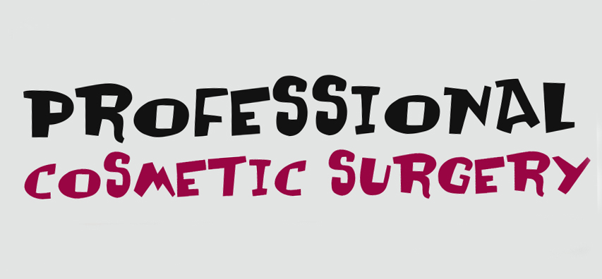
A true professional?
Eeek! Would you trust this company with a quick nip and tuck? That font looks too handmade and not serious enough for our liking...
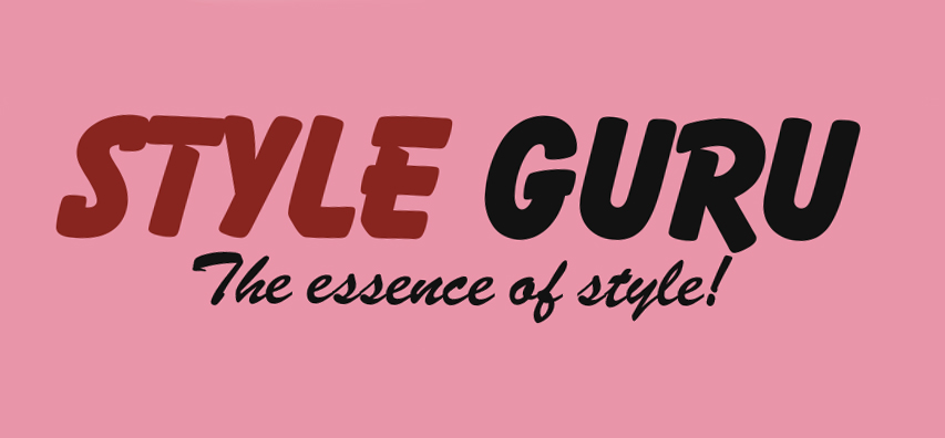
Stylish back in the day?
Style isn't really what springs to mind when we see a logo that looks like
it was created for a 1980's discount store.
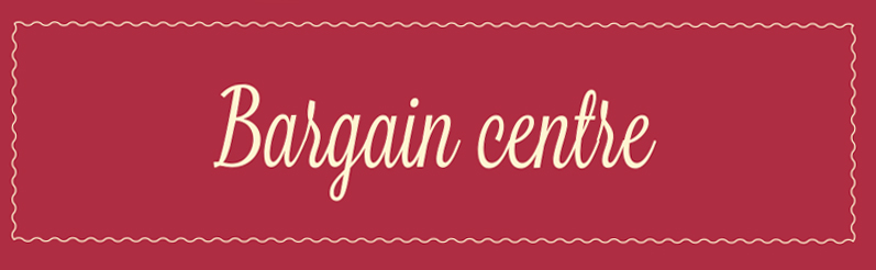
Not many bargains to be found here...
This script font is too discrete for a bargain shop. Something bolder is required.