Previously, in part 2 of this series, I talked about the benefit of using multistep forms on your website to get more insights on user behaviour that ultimately lead to more enquiries for your business.
Now we focus our attention on the humble 'thank you' page and how to get the most from it.
What is a 'thank you' page?
It's basically the page that users reach after they've submitted their enquiry. It will usually say something like 'Thanks for your enquiry, we'll be in touch soon', and it's mostly used in lead generation.
In terms of user experience, it's of less importance, since the pages before this have done the heavy lifting and it merely acts as a confirmation page. It has a much more important role internally as a tracking page for paid ad optimisation.
An opportunity to get extra enquiries
Over the years, we've seen a 13% increase in phone call enquiries by adding a 'call now' button to the thank you page.
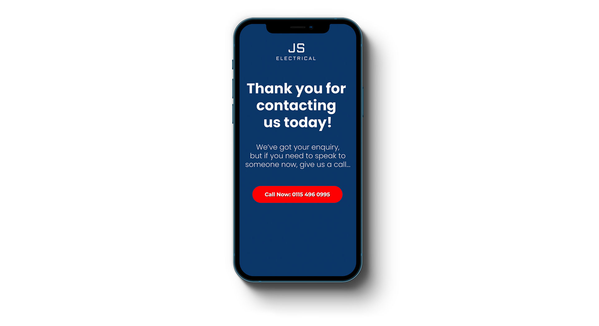 An example of a 'thank you' page with an additional call to action button
When users are at this point in their customer journey, they're much more likely to want to speak with someone whilst the product or service is fresh in their mind. So it makes sense to encourage mobile users to chat about their requirements in more detail. It means:
- You get an early opportunity to address concerns and provide reassurance
- They will feel more connected with your business over a competitor's
- You get instant feedback on the success of the landing page
Adding a booking calendar
Recently, we ran a campaign on Meta using a standard lead form format. Amazingly, 15% of potential customers also booked an appointment directly using a 'book your appointment' calendar button on a page that was accessed after they'd left their details.
Of those directly booked leads, 94% were considered better quality than those who simply left their details for the client to call back.
The biggest winners of this strategy are e-commerce businesses
Whilst e-commerce businesses may have felt left out in part 2 of this series, they are by far the biggest winners here because the equivalent of a 'call now' button for an online store is the one-click upsell. This has by far the biggest ROI of all.
Whilst not really a 'thank you' page as such, these pages appear after you've submitted your payment details for an online purchase, but before you get to the order confirmation page. It will say something like 'Would you like to add [product] to your order?'
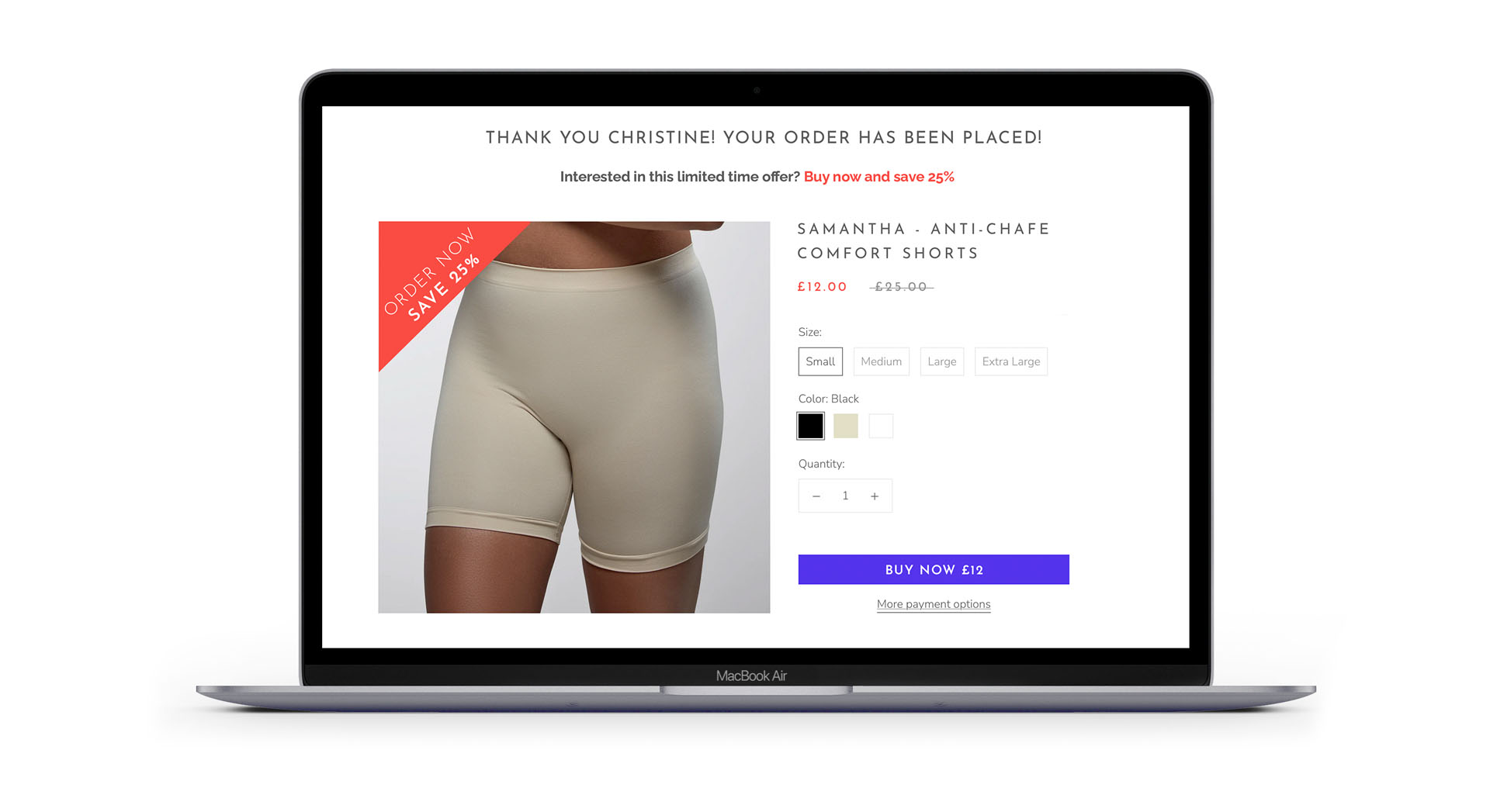 An example of a 'one click upsell' page. You can read more about this project here.
The 'upsell' will usually be a lower-value product. They're usually impulse purchases, so the perceived value should be much higher than the cost.
Adding a one-click upsell can increase customer lifetime value (LTV) by over 18%.
So, to recap
In this three-part series, I've discussed different ways to improve your landing page in order to maximise enquiries and sales.
Part 1 covered the fundamentals – the essential elements that every landing page must contain in order to be successful. In part 2, I discussed contact forms and ways to make your forms more engaging for users whilst being able to measure the effectiveness of forms even before they're submitted. And finally, I've talked about the potential of thank you pages and one-click upsells.

 Back to all articles